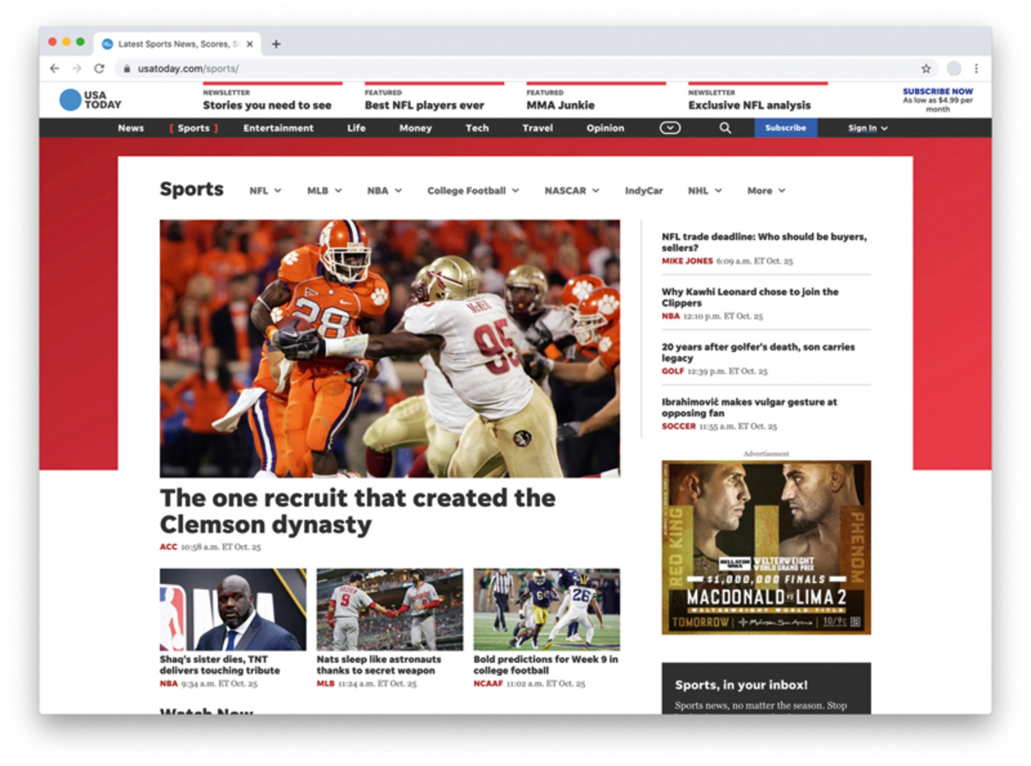
 The new USATODAY.com includes color-coded sections to make it easier for users to navigate.
In late October, USA TODAY unveiled upgrades and a new design to USATODAY.com. It’s the first major redesign since 2012 when the organization commemorated its 30th anniversary.
Among the many new features are a mix of color to distinguish sections (blue for news, red for sports, green for money, etc.), competitive page speed, a “virtual highlighter,” to signify when content is an opinion piece, and improved content organization and website search.
Jason Jedlinski, senior vice president and head of consumer products, told E&P that the organization felt it was time to invest in the full screen laptop and tablet experience, and integrate some of the more modern features that had been working in mobile.
Jedlinski and his team spent several months deciding what the redesign should look like and studying data regarding the journeys that online users took, where they spend their time, and the personas of the people they were trying to reach and engage. What they found were four principles from a product design standpoint: understand problems before trying to solve them, support risk-taking, conduct true experiments, and only build things they thought could have a material measurable value.
Through that process they found some surprising insights and conclusions. For example, Jedlinski said that users did not understand Life—one of the core sections since 1982 that included coverage of the Oscars, Grammys and celebrities—was an actual section; readers only thought of it as entertainment. As result, they decided to create an entertainment section separate from Life.
With plenty of insights like this and other inspirations to draw from, USA TODAY spent May through August 2019 developing the features of the redesign. By Labor Day, they began testing the redesign with a small percentage of their audience before finally launching it.
“We heard from people complimenting the labeling and the very clear delineation of branded content, sponsored content, editorials and op-eds,” Jedlinski said.
He added readers also liked the removal of the comment option for stories. Of course, those that commented regularly were disappointed but there was a group that applauded the decision.
“This was a daunting challenge for me and some of my team leads, given USA TODAY’s history as an innovator—1982 print and Al Neuharth’s vision of breaking the rules, (but) that heritage inspired us,” Jedlinski said. “We put a lot of pressure on ourselves to do something that would respect the brand, premium advertisers, Pulitzer Prize winning journalism and the expectations of millions of readers.”


Comments
No comments on this item Please log in to comment by clicking here